Aperitif
Client
NDA (Upwork)
Location
SF, USA
Year
2019 - 2020
The app was designed successfully and delivered to qualified developers as a completed Figma file with all proper layers, an embedded design system with colors, forts, and design components in the library.

0. Intro
The story behind this app is super interesting. In fact, I can not tell you it all in detail, simply because it’s partly under an NDA. The agreement was to de-brand the app and transfer it to a functional design, focused on the specific location: the Silicon Walley. A client has added a couple of suggestions regarding the home page content. The other additional features were related to the secure login, and of course – the bar admin part (business user). The app was designed successfully and delivered to qualified developers as a completed Figma file with all proper layers, an embedded design system with colors, forts, and design components in the library.

Example of the mood board and colors that were used
In a nutshell, in this case study you will find a hybrid, re-branded, de-personified app: from a student project to a San Francisco startup.
I kept some unique elements as a decoration. I hope this little case study will not harm the owners' attempts to raise more capital 📈.

Client mobile app outlines
What was interesting, once the client approached me, they didn’t know about this project. This means, they occasionally selected me amongst others because I had the proper portfolio with… the app they needed!

Sample from the wireframes for the original app
FInally, I’ve got a solo senior designer role on a small project of 4 people. In fact, the co-founders had a few wireframes with unclear user flow. What they also knew was a chain of bars and cafes’ in the SF area that might be interested in the solution. The unique proposition is simple and promising: they planned to sell a SaaS app with a proposition on how to serve people quicker and earn more with fewer efforts. Pretty intuitive and engaging business model. In fact, in 2018 no one knows about Covid, the restrictions, and the necessity of having such an app in almost every bar and cafe.

Business client app samples
Let’s have a look at the project from the Design Thinking framework perspective. In 2019 I participated the Design Thinking conference in Bydgoszcz, Poland [Polishopa], and was inspired by Silke Bochat from Niemcy, Tey Bannerman from McKinsey & Company, Adrian Chernoff from Johnson & Johnson, Mike Pinder from Board of Innovation, and Piotr Sałata from SYMETRIA and a lot of other brilliant speakers Kudos to SHOPA who invited such a high-level line up under a common roof of Bydgoszcz Opera palace.
Design Thinking allows deciding on a business problem using an iterative design approach that mixes creativity with testing a product or feature with real users.

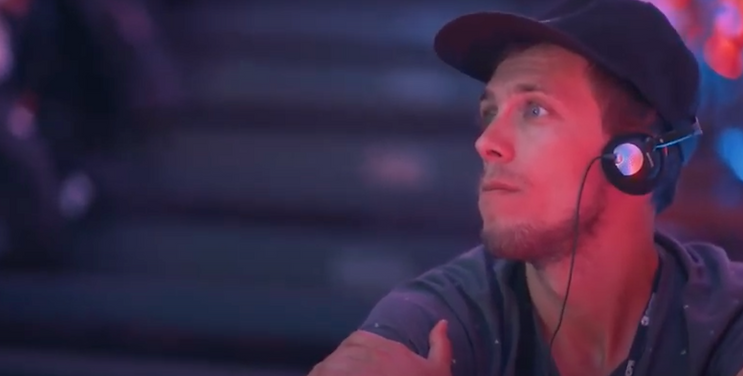
Den at Polishopa Design Thinking Conference, 2019
In a nutshell, Design Thinking is a framework that if used well can bring a creative solution even to regular service.

Design Thinking process in action (image from NN/g)
Chapter 1: Understand
1.1. Empathize
As this project was time-demanding and had its deadline, the design process was pretty simple. I started with the interview with the key stakeholders to set up a long-term goal. Once set, the next step was a proper research to observe where and if the user's problem exists. Please find the research outcomes in the Define part.

Part of the research outcomes with the User flow results
1.2. Define
1.2.1. Problem #1
There was one common problem in the vast majority of booking applications. Services such as Thefork and Lafourchette (Tripadvisor), Resy (Airbnb), Open Table, Zoomato, Allset ets. allow you to book a table in the most popular European, American, Asian, and Australian restaurants, favorite by non-budget tourists.
All over the countries of the former USSR, in the Balkans, and in some countries of Central and Eastern Europe, it is extremely hard to find a good application with a well-designed interface for booking tables online. However, this is an emerging market, solvency and the number of local residents and tourists in the cities of which is equal to, and sometimes exceeds, similar figures in a number of Western European cities.

Book a table app European map, 2019
1.2.2. Problem #2
The second and biggest problem lies in the complete or partial absence of reviewing the menu of restaurants, and of course, ordering food and paying a bill in advance.

Menu preview UI sample
The client was a super empathetic and proactive thinker. I shared the research results and we discussed in detail market possibilities, and how the app may be implemented into the existing business environments. The next step was a UI ideation. This is a creative process that may have unpredictable duration, which means the earlier we start, the better would be the end result. Especially, when you work remotely.
Chapter 2: Explore
2.1. Ideate
Design Thinking contains a lot of well-tested workable practices and does not limit you to experimenting with combining them togather or testing your own tricks, depending on the situation and information you have and can get. I saw those tricks at my friend’s logo studio, and then found this beautiful trick in a book: we have a set of special cool and fun questions in a form of a quiz so that the owners and decision-makers are immersed in the creative process and share their ideas with the design team who are here to make you ideas come true. Mind us as magic builders, but we use not bricks but pixels. Starting from Pixel One.

Login & onboarding flow UI samples
As you can guess, we re-used a lot from the original Aperitif app, especially from it's end user design samples. However, this project entailed the business app user flow, that was not designed previously and required additional effort. Business app was aimed be a selling point: it has to work fast, be intuitive, but still look good and match the client’s app UI look and feel.
2.2. Prototype
The prototype itself was built using the Figma app Prototype tool. As a test device for the user flow was selected an iPhone 11, while for the business app there were 2 similar cases but for different devices: iPhone and iPad (to provide a quicker and reacher experience that comes with a bigger screen). Client was thinking about the idea to sell iPads with built-in software and equipped with special waterproof covers: you newer know what may happen in a bar in the middle of the work shift.
When I was a student, I worked as a bartender and knew this environment well enough: in my practice, there were really strange cases when the beer can was blown and the whole bar was wet and sticky, or when the owner’s wife decided to put a foaming detergent to the washing machine and we had a real unstoppable foam ‘party’ 🛁🕺🏼💃🏽.

Business app - 'napkin drawing' wireframes
More details about how the prototype behaves you can find in the next chapter.
Chapter 3: Materialize
3.1. Test
3.1.1. The original app was tested with 6 users from different countries: students, IT people, housewives, and school personnel.

User Persona Interview snapshot example
3.1.2. The business app was tested internally with co-founders and their friends. In the process of design, I created a couple of clickable prototypes with different levels of detail so that we can test the app properly with the target audience: the cafe, bar, and restaurant owners, and general managers, who decide to buy the app or not.

Prototype flow sample for the Mobile User Testing

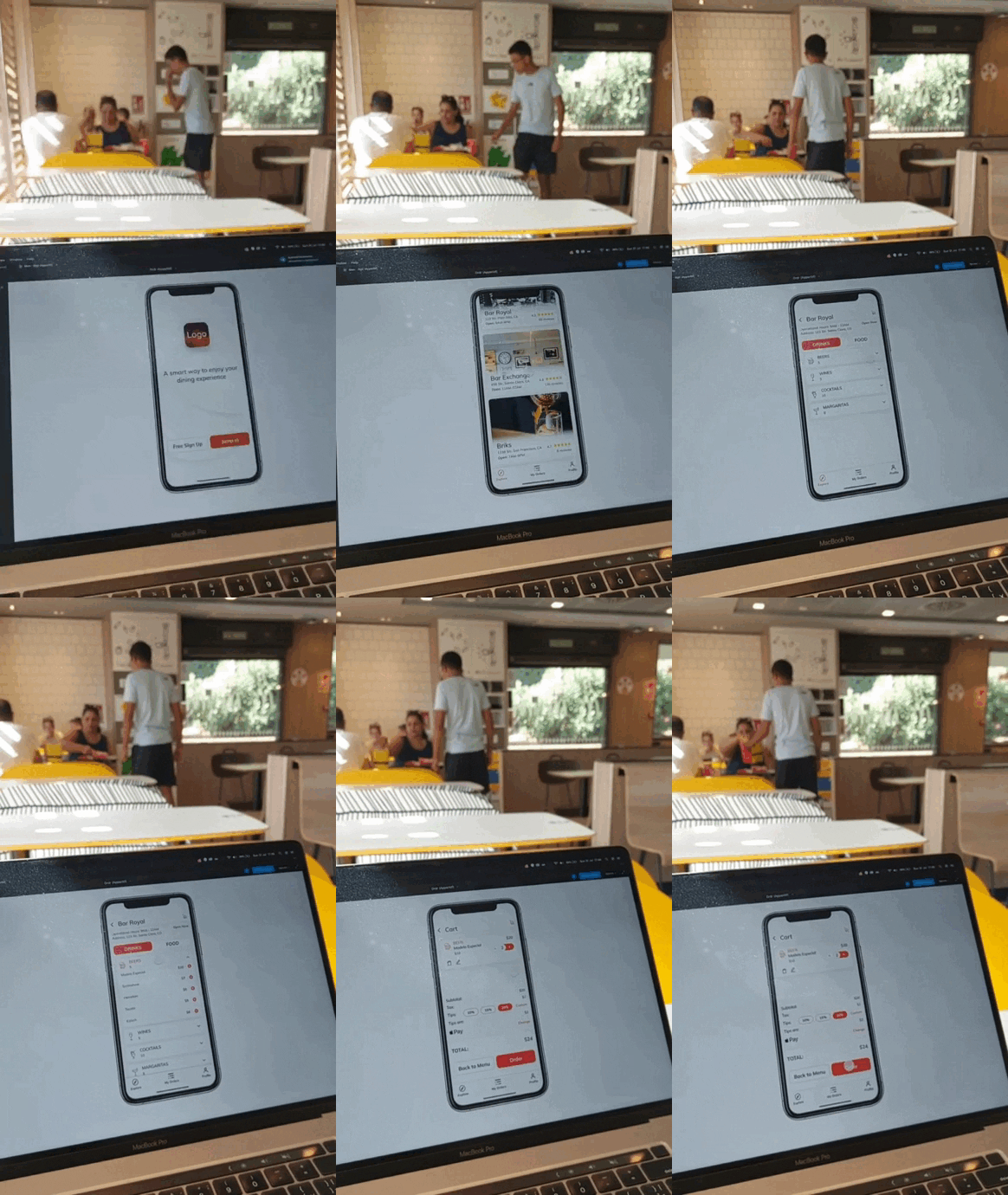
3.1.3. The final user testing was done via the Figma prototype tool on mobile. The prototype itself was so detailed, that the user was almost about to believe that this is a real app. That was a point of success: a target user treats an app as a real product as intuitive and as real as the app's look and feels.
I was observing the user behaviour from the laptop. This is one of th emost exciting parts of the UX design process. When you see how the user is walking through the app, you get a lot of insights and understand the user deeply.
Sure, a user-testing is not giving a 100% real picture, because not 6 nor even a hundred users will tell you about the best practice. But what you can get is to verify the hypothesis and understand if the users gets the whole app's idea and uses it's core functional with no confuses.
User testing flow sample,
testing in local McDonalds
3.2. Implement
The project planning process was pretty agileish. We did not use sprints and worked with a hybrid Kanban board. I was the only 1 designer and only 1 part of the team who could work full time.

Task tracking board (NDA)
3.2.1. Implementation details
The app design was divided into 3 meaningful subprojects:
-
End user part - a client app that enlists the places nearby you (the app was aimed to cover the SF area for the MVP). Outcome: a hybrid mobile app with reduced functionality for IOS and Android
-
Business user part - a B2B admin app that covered a business user functionality, including compensation, statistics, access, and user management.
-
App finalization with the MVP user testing outcomes and fixes. In addition, adaptation to tablets (was a bonus for the client).

Mibile and tablet app design screens in Figma
While a client was fulfilling the brief I was working on the market research and started to collect my project’s mood board. The market was at its beginnings, no one knows about COVID restrictions and food delivery was always a plan C. This is how can now you can estimate the app: imagine how much money could it potentially make in exchange for on-time delivery and smart marketing. I could say that we caught the trend!

Design system UI sample
3.2.2. Design System
The app was designed with a classic approach:
>parer>wireframes>UI
In order to make the app design consistent and quickly adjust the content and of course, build new screens, I used a simple yet fully designed system based on Material Design from Google mixed with Human Interface Guidelines from Apple (the original idea was to create the app for iPhones that then can be easily transferred to the Android OS).
When the native design system had limitations or went out of style, I adjusted it with the custom components. The design approach kept minimalistic, with tasty roasted beefsteak accent colors.

Business app, waiter user UI sample
A story from Den Tkachenko,
Head of design at PXL1